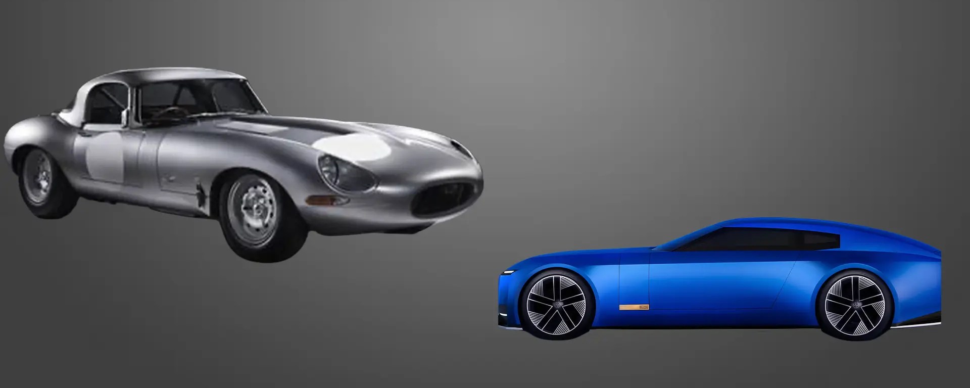
Jaguar didn’t just change a logo; they attempted to “delete” the Leaper. In a move that has ignited the design world and alienated the traditionalists, the British icon has unveiled a rebrand so radical it feels less like an evolution and more like a total erasure of its 90-year heritage. But beneath the “Copy Nothing” marketing and the neon-hued visuals lies a calculated, high-stakes gamble in aesthetic displacement.
While the internet is busy being outraged, however, I’m focused on the design physics behind this drastic pivot.
RELATED: The Death of the Tablet? Samsung’s Galaxy Z TriFold and the New Physics of Mobile Content
Table of Contents
The Delete Key: Brand Erasure as Strategy
Jaguar’s replacement of the iconic leaping cat with a spaced-out, sans-serif logotype is a definitive move toward hardware agnosticism. In the internal logic of the modern EV transition, “Heritage” (leather, wood, and the mechanical roar of a V12) is often viewed as a liability for tech-forward perception. By removing the animal and the curves, Jaguar signals that the vehicle is no longer a “beast” to be tamed but a “device” to be operated. They are clearing the visual deck to prepare for a future where software architecture is more marketable than sheet-metal heritage.
The 16-Bar Strikethrough: The Logic of the Grid

Photo: Jaguar
One of the most technical elements of the reboot is the introduction of the “Strikethrough”—a 16-bar horizontal grid that now anchors the brand’s imagery. From an engineering perspective, this is a pivot towards linearity. Whereas the classic Jaguar silhouette was defined by the organic “E-Type” curve, the new era is defined by the “Grid.” This suggests a brand that is moving away from nature and toward efficiency, math, and digital precision. It is an intentional move to distance the brand from the “Dirty” era of combustion and into the “Clean” era of the algorithm.
The “Ghost Brand” Vacuum
The most dangerous part of this reboot isn’t the font—it’s the timing. Jaguar has effectively launched a new identity before showing a new car, essentially creating a brand vacuum. Without a high-performance GT or a piece of physical hardware to anchor these abstract visuals, the public has been left to fill the void with memes and contempt. This is a “Burn the Ships” maneuver: by destroying their current identity before the new product is ready, Jaguar has ensured that there is no turning back.
The Verdict: A Demographic Pivot
Make no mistake, this isn’t just a demographic pivot. Jaguar is betting that a 25-year-old tech founder in Dubai or a design enthusiast in Shanghai cares more about “Exuberant Minimalism” than a 60-year-old purist in London cares about British Racing Green.
Whether this is a $2.5 billion masterstroke or a case of “Aesthetic Suicide” won’t be decided by the logo—it will be decided by the first car to roll out of the factory under the new banner. For now, the “Leaper” is in the archive, and the “Line” is all we have left.
RELATED: Why the 2026 Mustang Dark Horse Perfectly Captures Retro-Future Design
Photo: Net Car Show; Jaguar, Freepik
Author Bio
Jael Rucker is the founder of Decked Out Magazine. She has previously worked as the Associate Commerce Editor at PureWow, focusing on analytics and trends to pitch stories and optimize articles that build and engage their audience. Her work has also been seen in Footwear News and WWD. Prior to 2024, she was the style and pop culture editor at ONE37pm for over three years, contributing numerous product reviews, brand profiles and fashion trend reports, which included interviewing Steph Curry, Snoop Dogg and more.